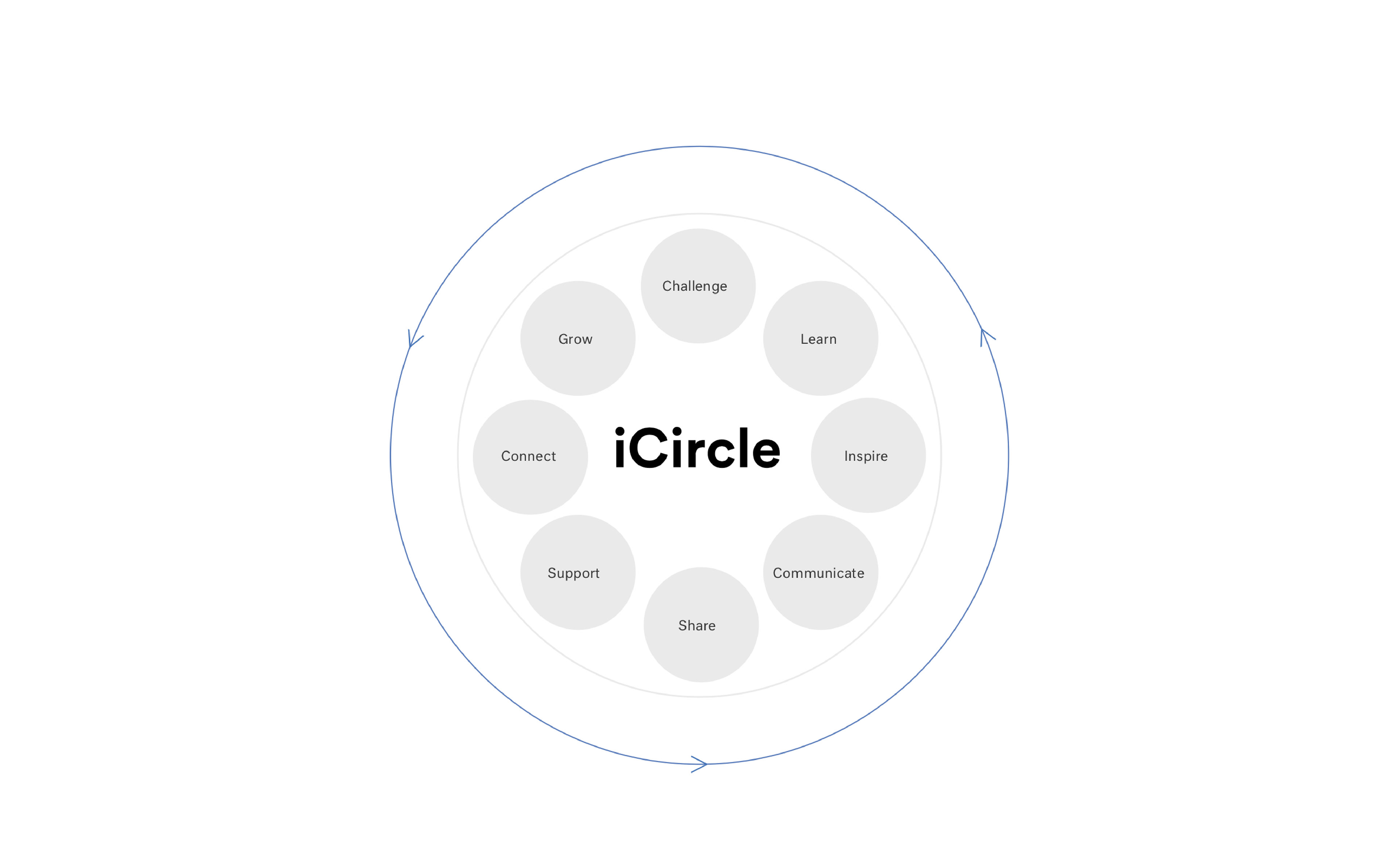
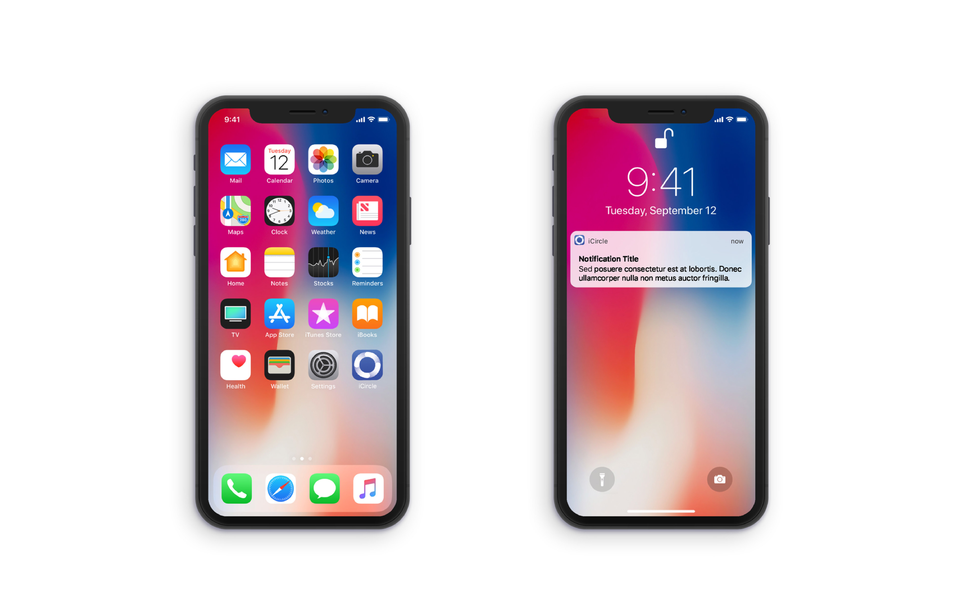
The name "iCircle" was inspired from the idea of karma which is the sum of a person’s actions in both present and past states, which influence the future of that individual. iCircle allows each user’s actions to not only benefit the individual, but also influences the entire community.
My Role: Concept, UX/UI Design, Branding
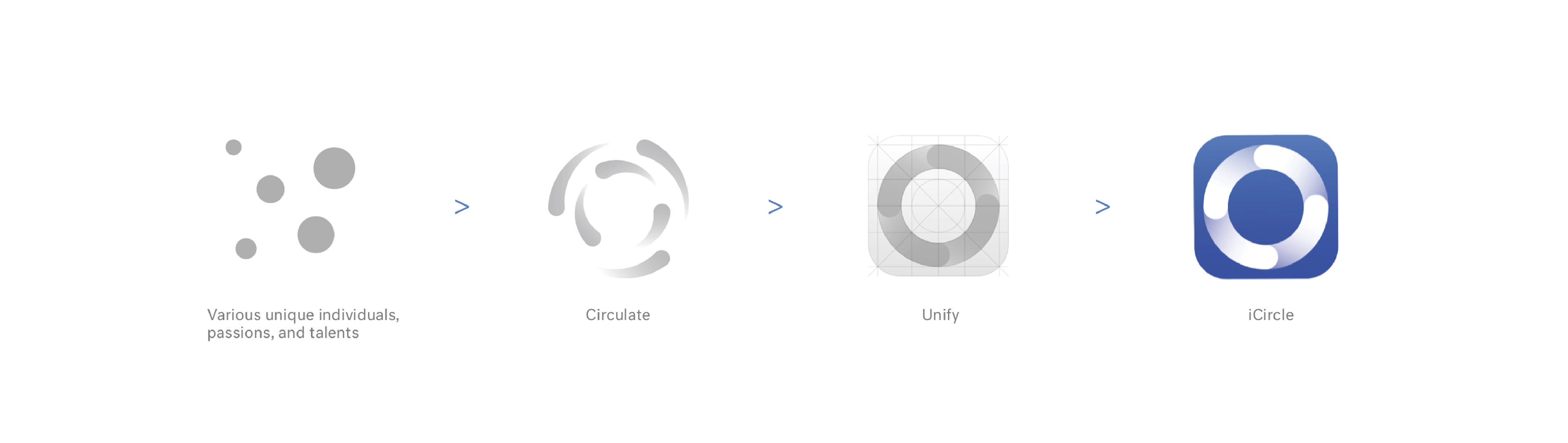
As one of Apple’s applications, the icon was created to be an osculating circle. It represents integration of various unique individuals, passions and talents, which circulate in a way that allows each element to benefit from the previous, while also motivating the next through shared inspirations.
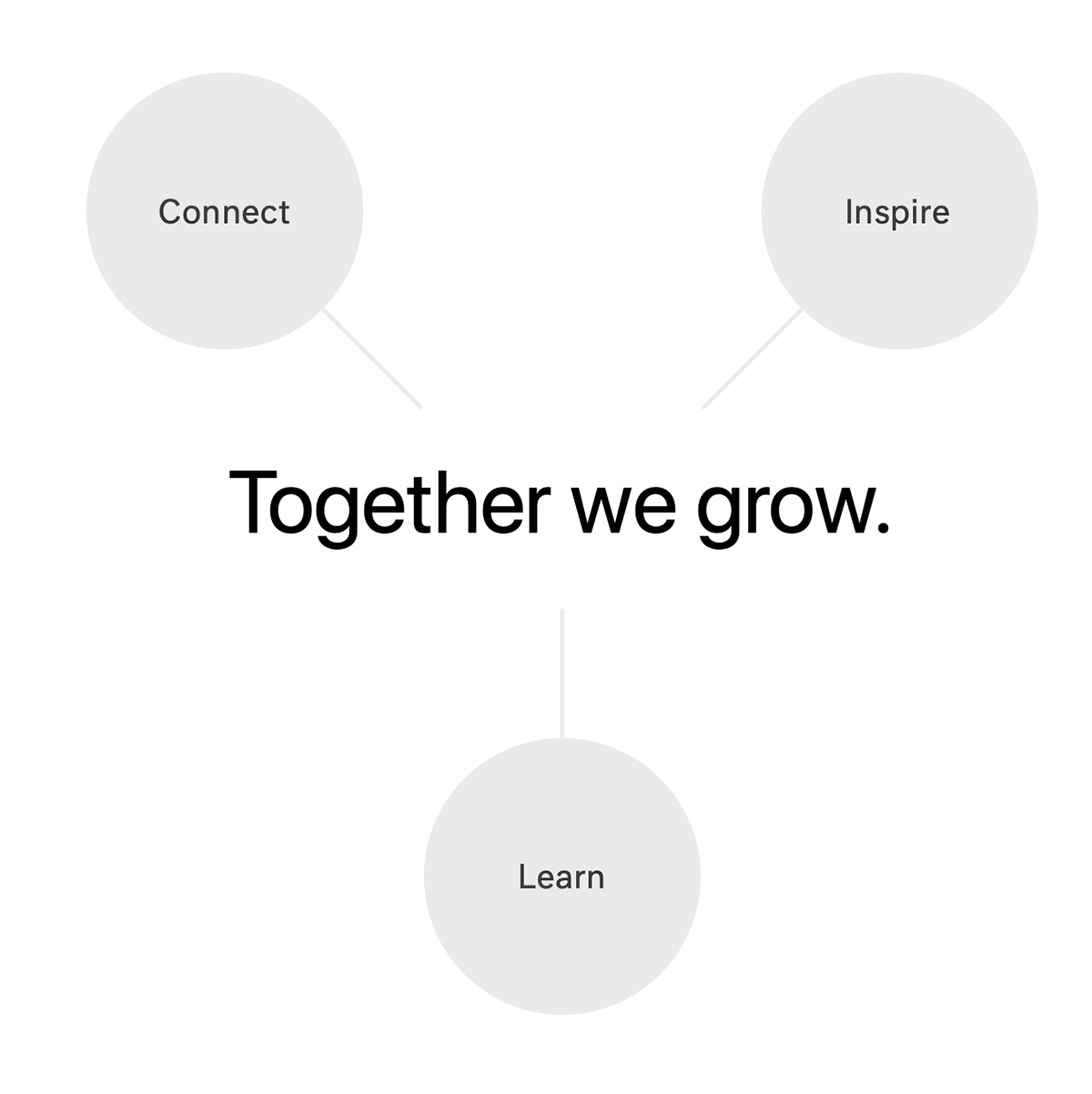
The “Together We Grow” tagline was inspired by the fact that Apple Store employees are unique and diverse individuals working in teams, with supportive peers, towards achieving universal success. Apple team members are encouraged to share their knowledge, passions, and talents with one another to help create a thriving community that allows everyone to grow together.
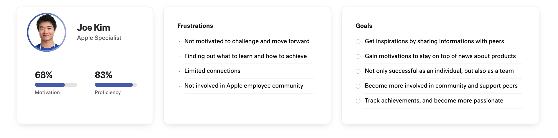
Persona
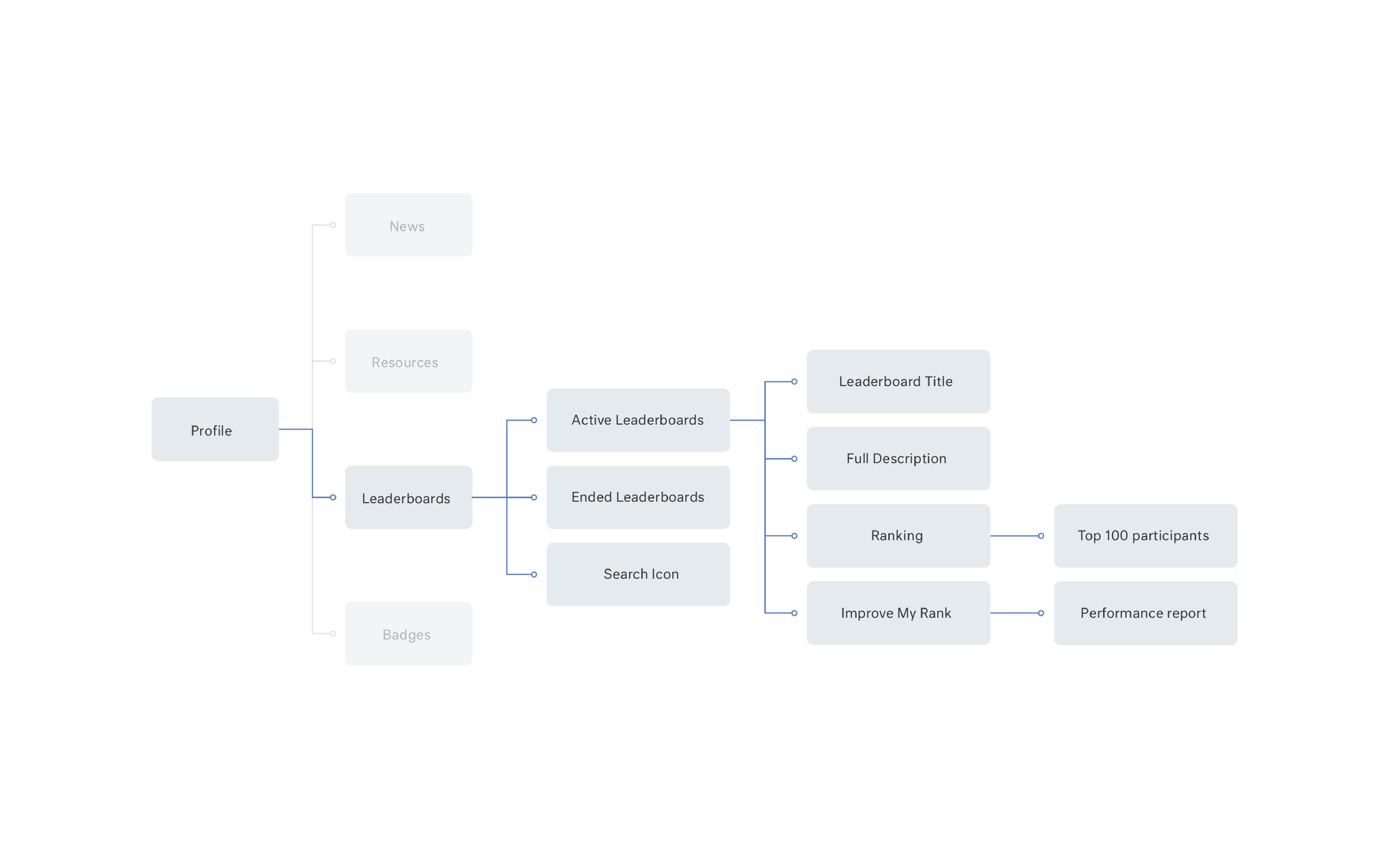
Information Architecture
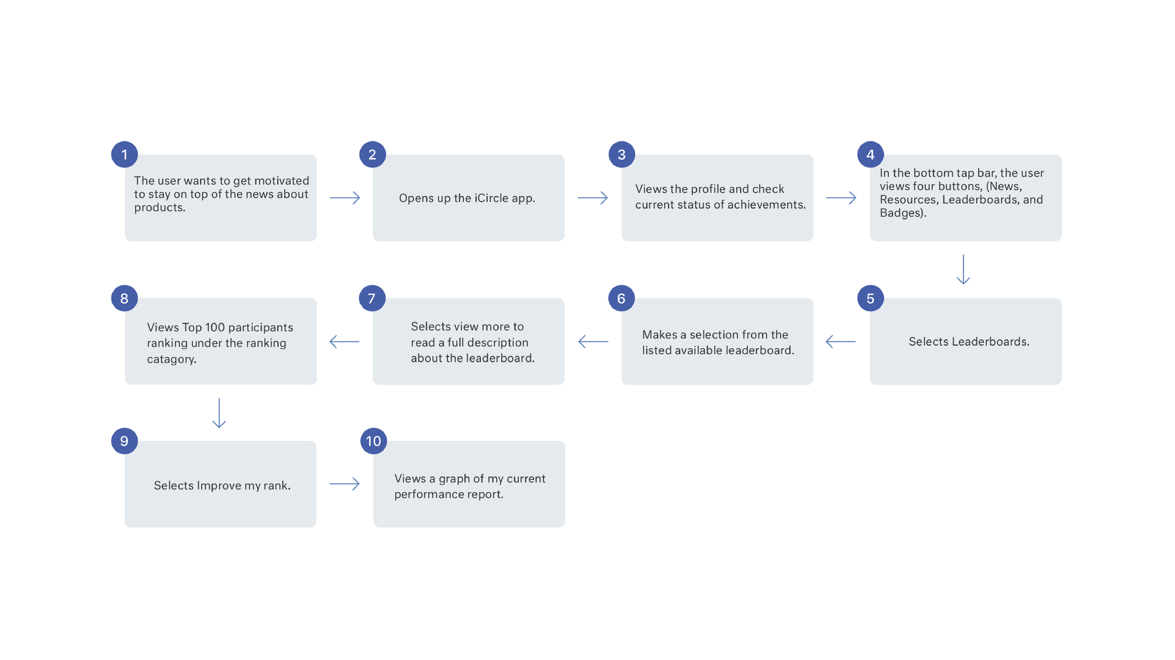
User Flow
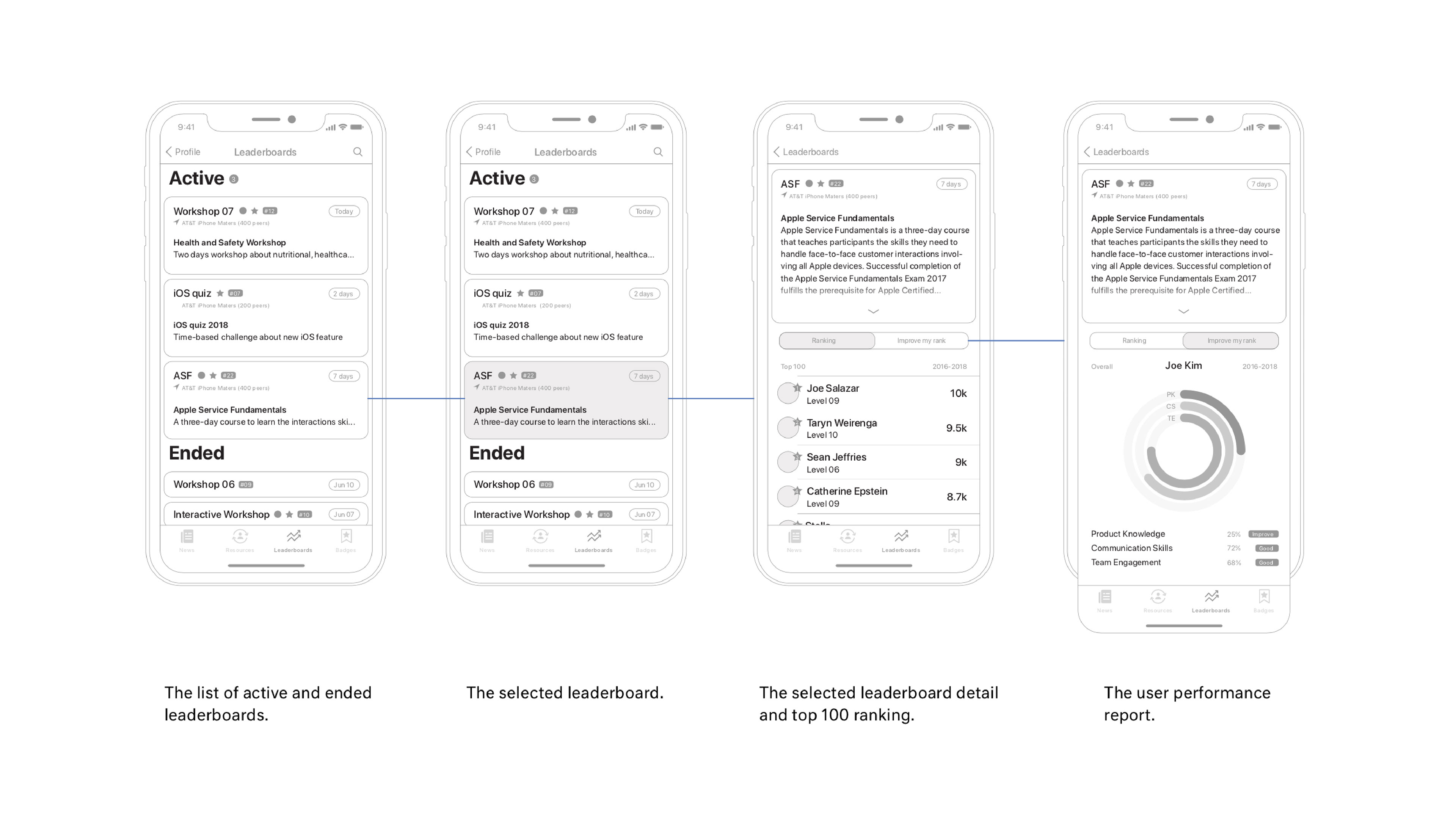
Hi-Fi Wireframe
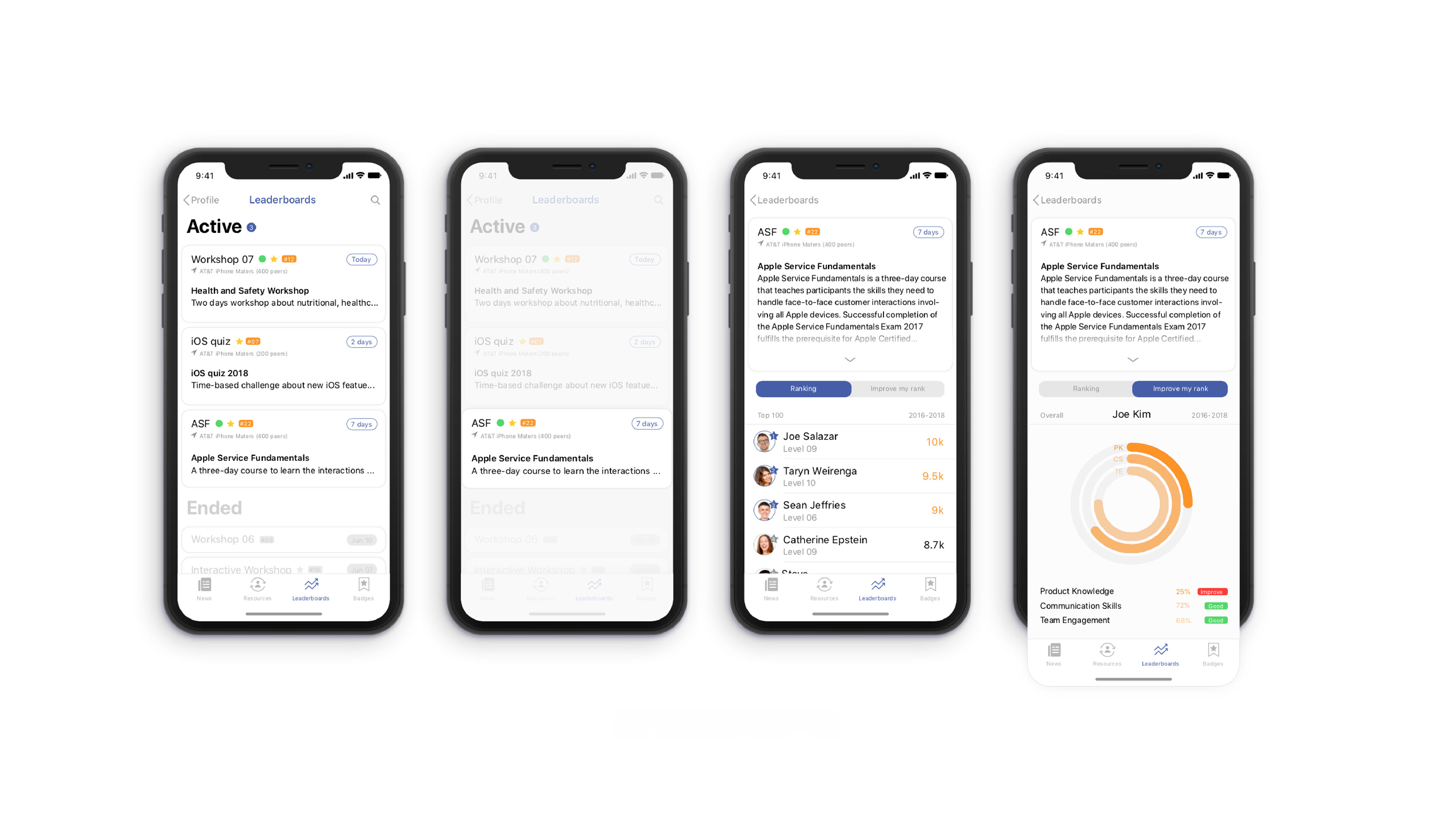
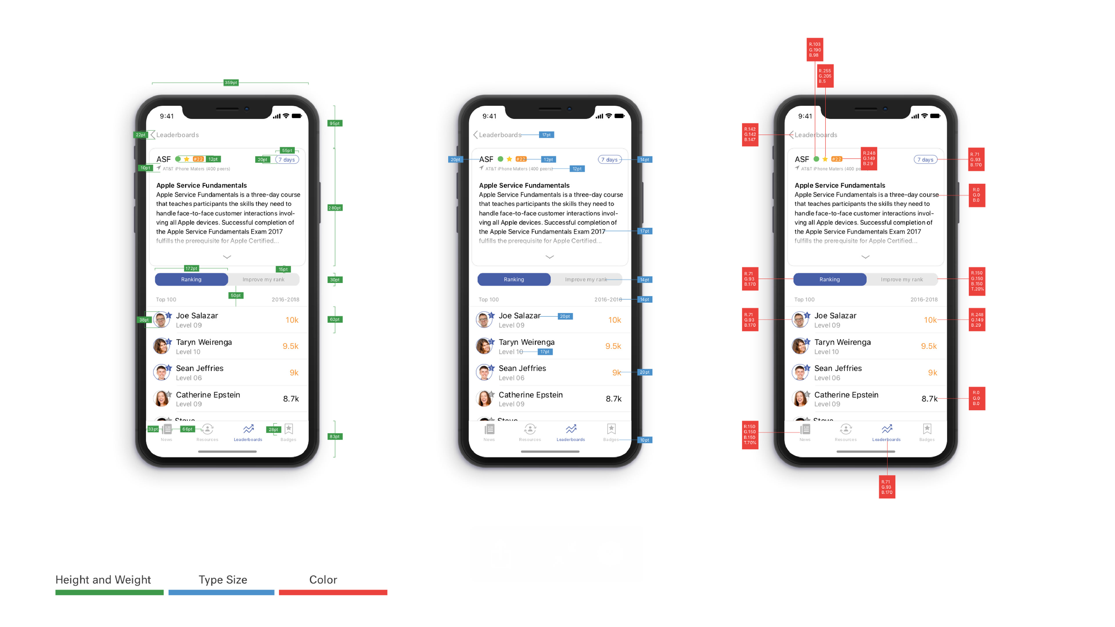
Final UI & Spec
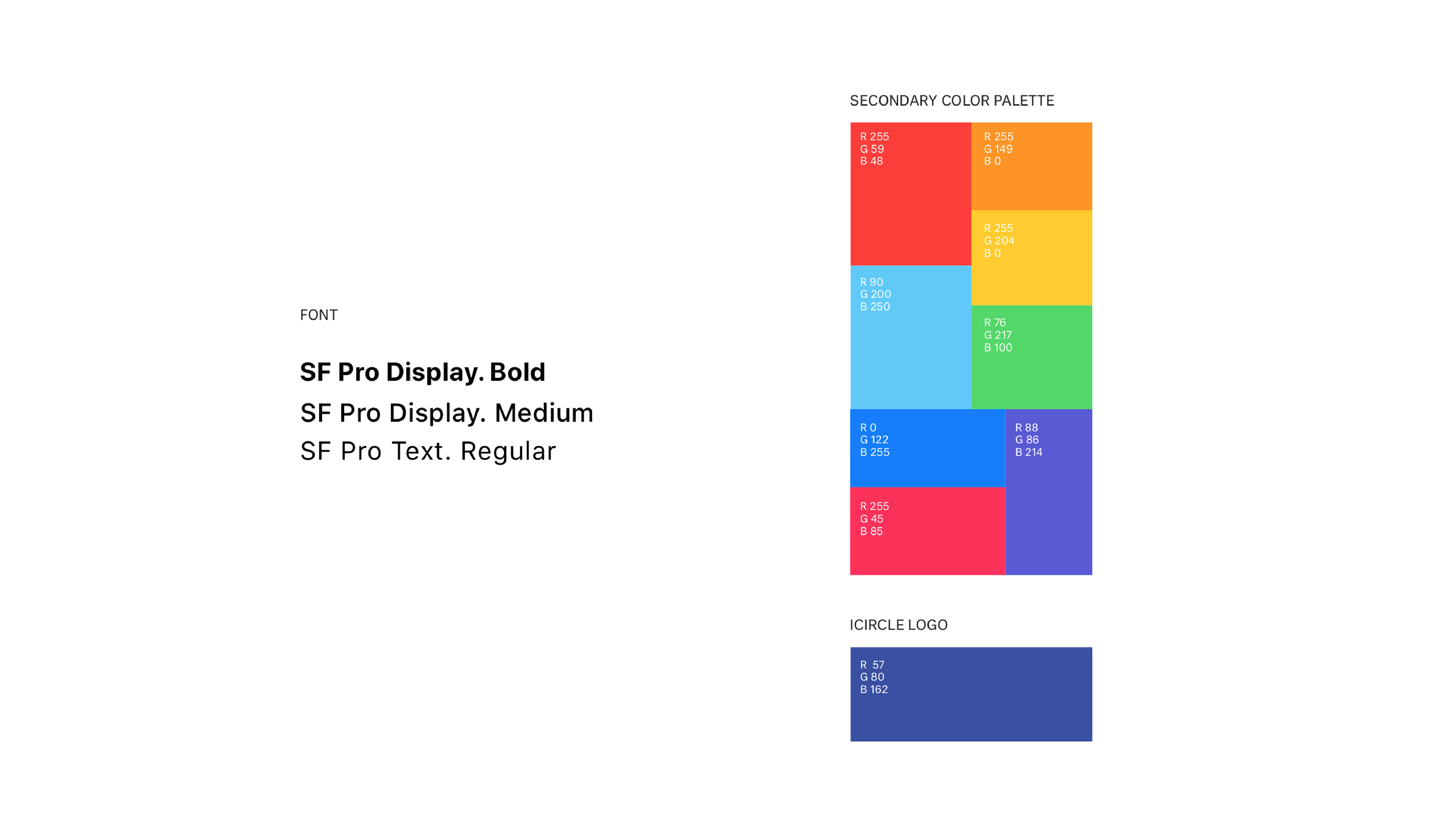
iCircle uses white as its background color to provide a simple and clean palette that allows accent colors to “pop out”, catching the eye of the viewer. The icon and main buttons use a dark blue inspired from the Apple store’s employee uniform color. Apple employees have always been diverse and passionate, reflecting the company’s culture and values, and to represent this, iCircle uses a full spectrum of eight colors.
Thanks for reading!