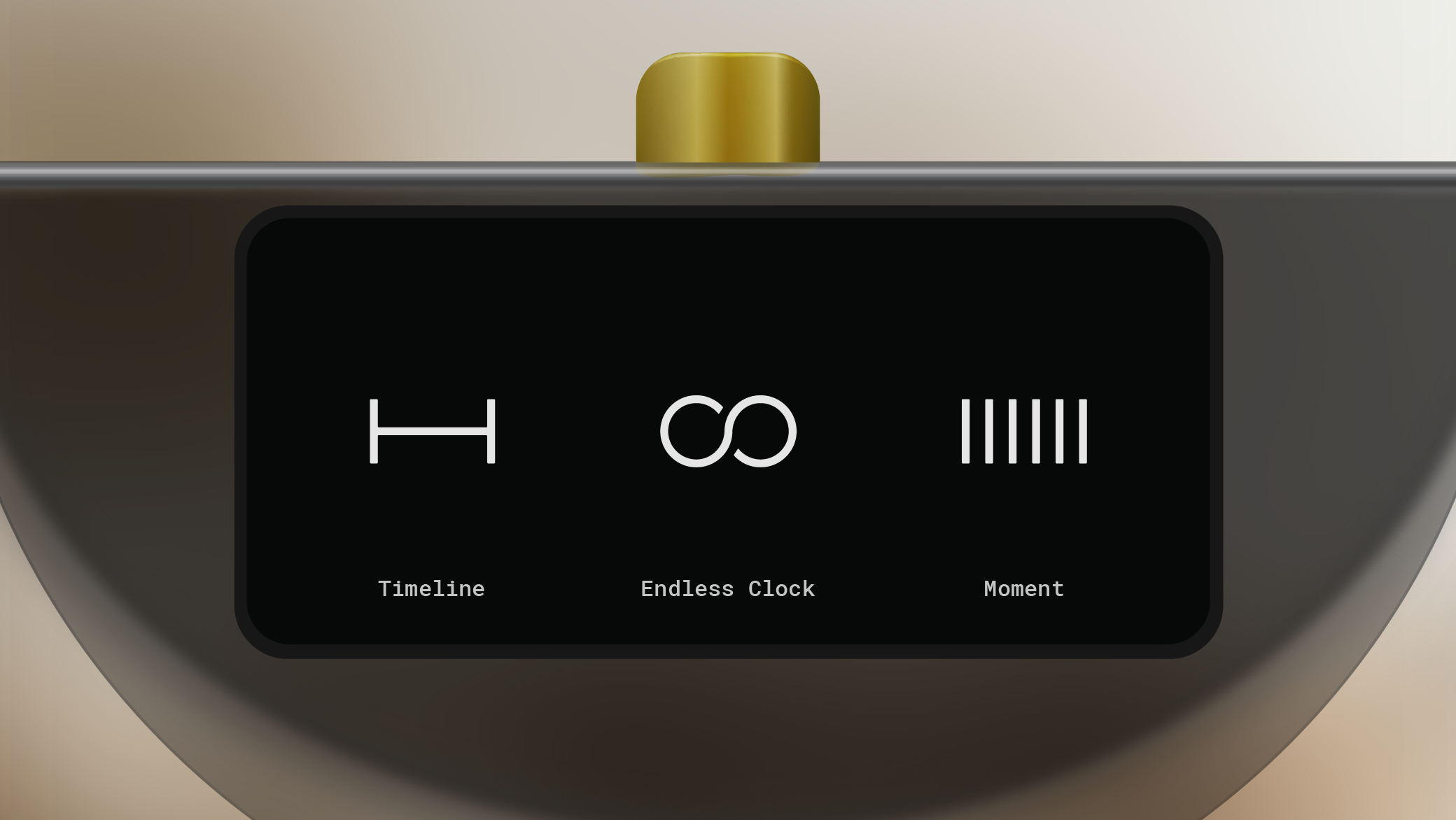
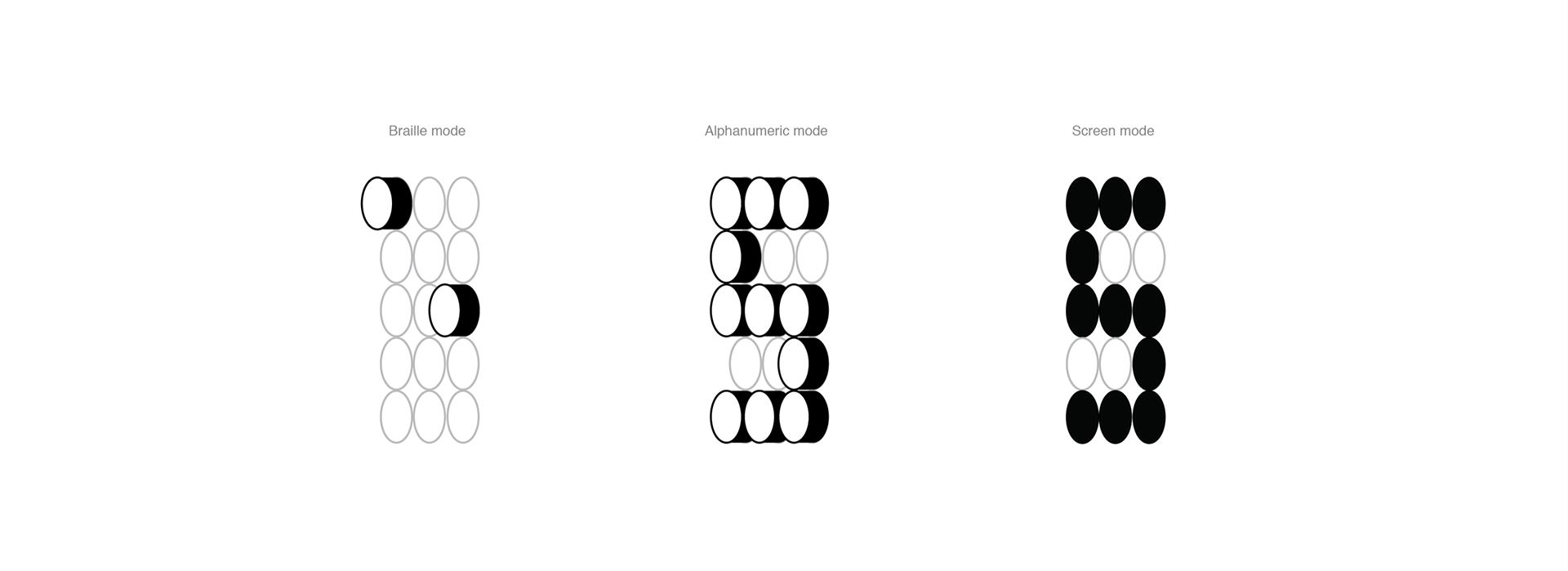
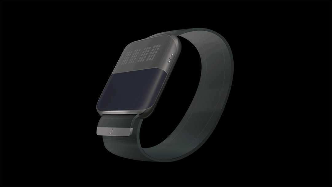
Toggle, an inclusive smartwatch prototype, caters to diverse users, including those with visual impairments. With braille, alpha, and screen modes, it communicates through touch, sight, and sound. The tactile display shows braille and Arabic numerals, while text messages are readable visually or via an audible screen reader. Toggle also supports voice calls like other smartwatches.
My Role: UX Design, UI Design, Art Direction, Brand Experience, Video Production, Branding
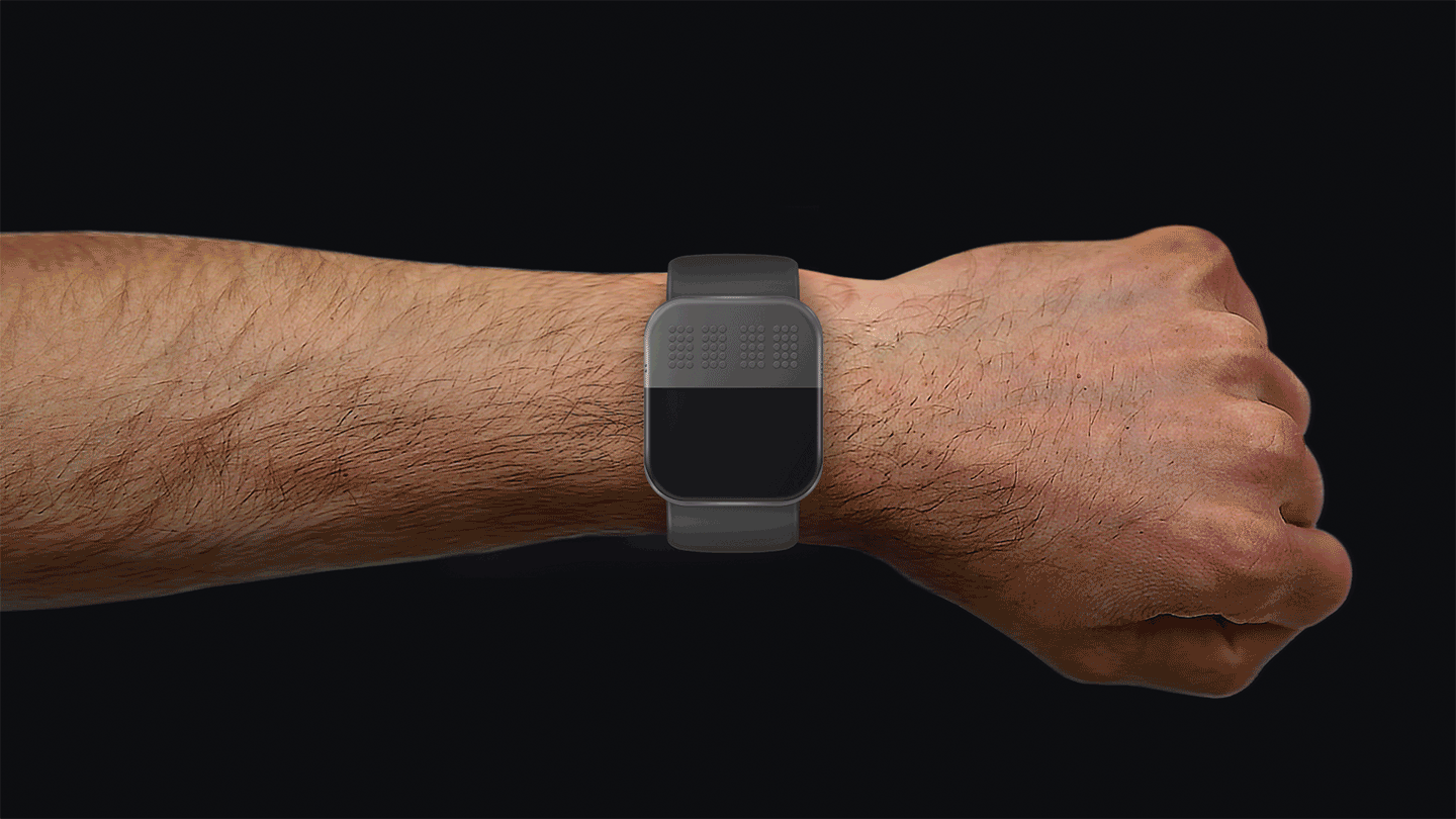
TOGGLE IS AN UNIVERSAL DESIGN CONCEPT
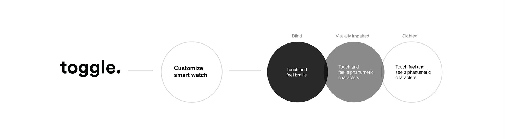
Driven by personal experiences and research, I aim to create an affordable solution, Toggle, connecting visually impaired and sighted individuals to advanced technology universally. Inspired by the success of universal design in physical spaces, my discomfort with a narrow focus propels me to pioneer an ethical and inclusive approach to technology. My thesis explores a universally applicable, well-designed device, promoting cost-effectiveness and widespread inclusion.
TOGGLE PATTERN FORMATION
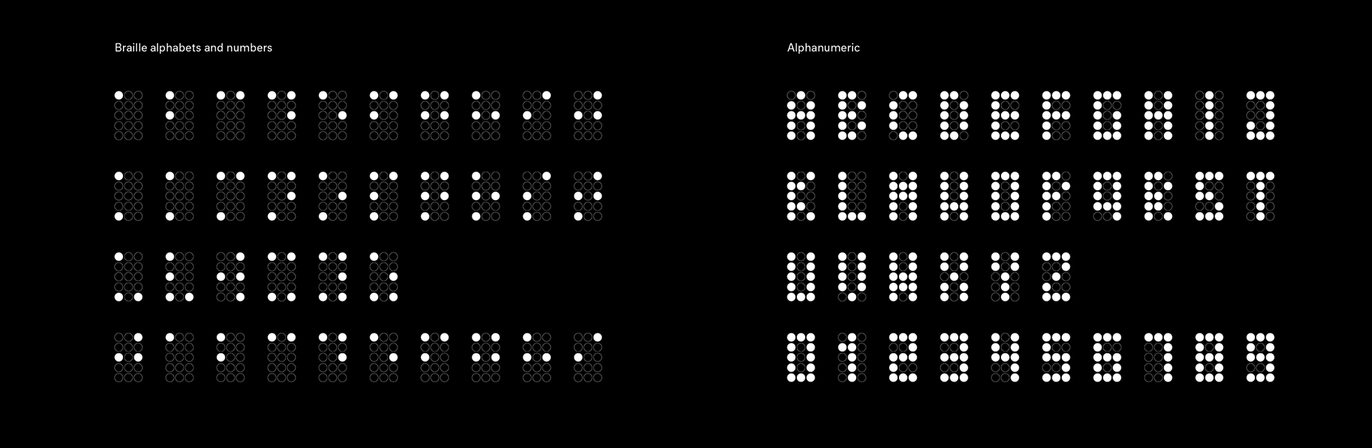
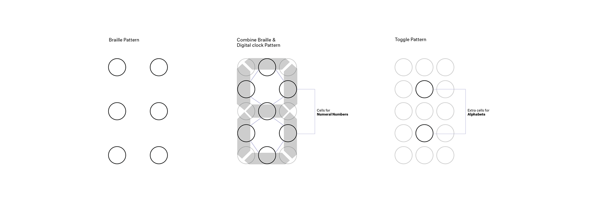
I started my initial research by understanding how braille works and the details of the writing systems. Then I started thinking of the similarities of the way braille refreshes to that of a old digital clock pattern. I wanted to try combining both. Hence, I added 7 cells in between the braille pattern, By doing this, all the numbers could be displayed in the same systems. The next challenge was to it all the alphabets into it, for this I added two more cells in the same system so that all the alphabets can be accommodated.
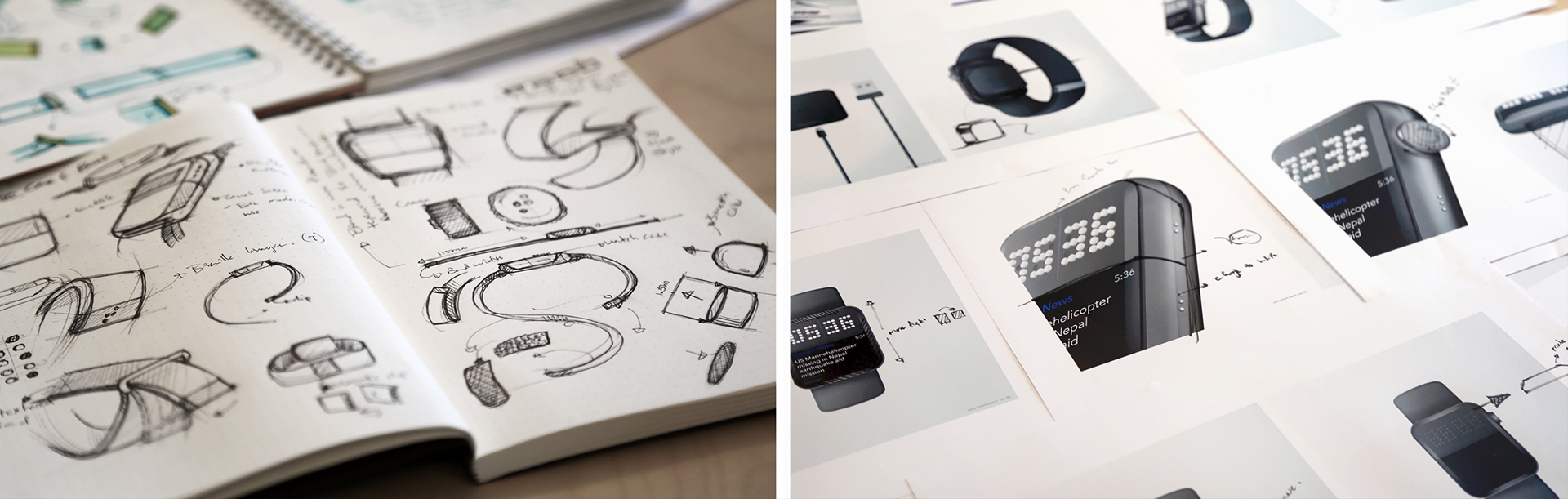
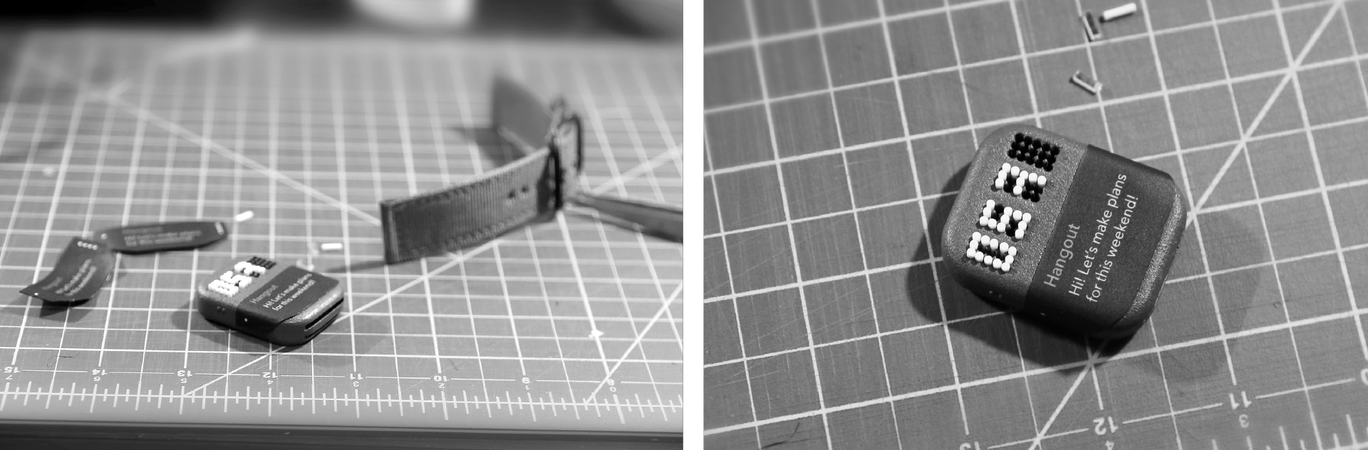
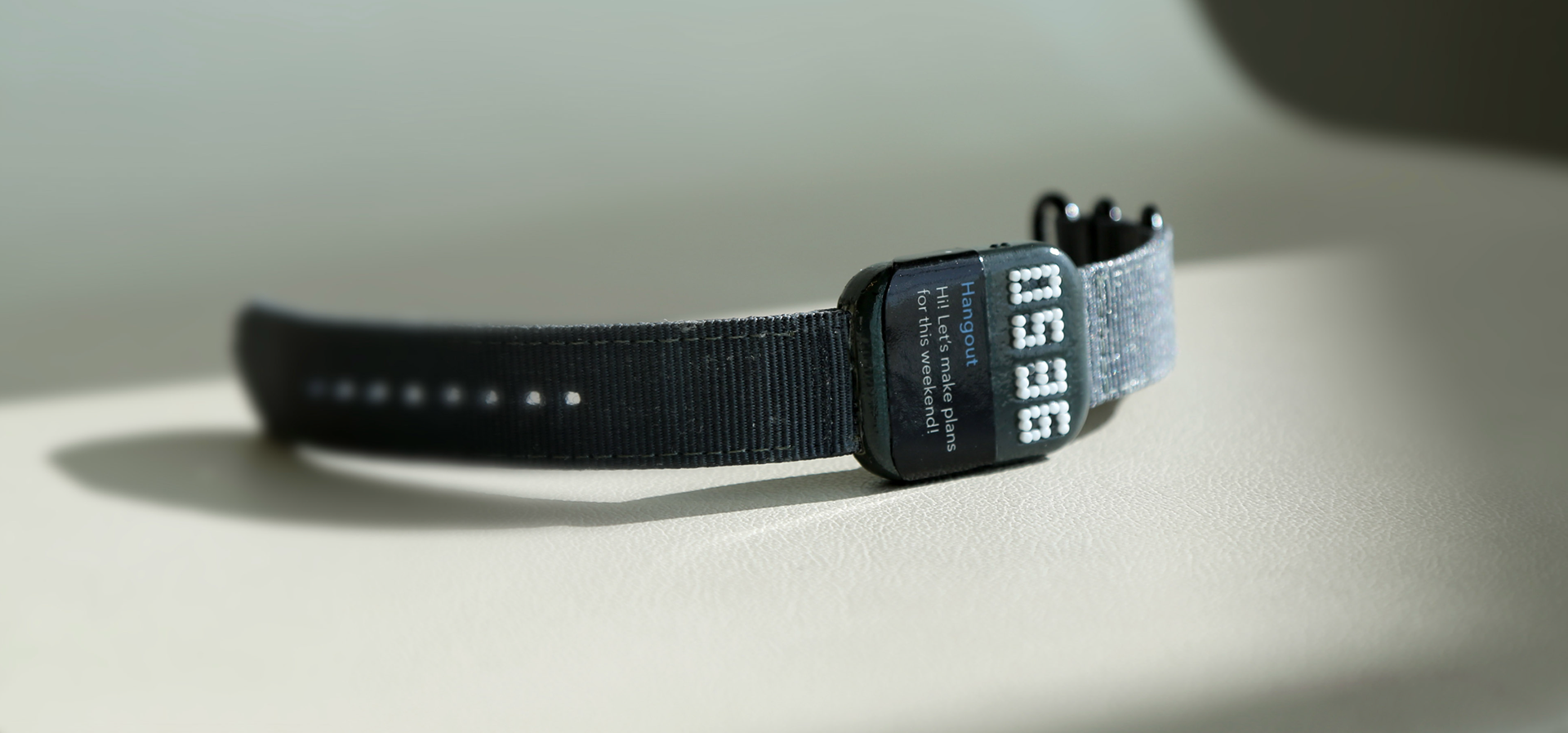
PROOF OF CONCEPT / PROTOTYPE
The inside mechanics of this prototype works in 2 layers.I first layered braille in one set and alpha numeral in another set. First, the braille layer surfaces on top. Then this layer moves down to merge with the alpha numeric layer. Finally, the two layers integrate to surface the alpha numeric mode on top. This is just a prototype that can be used as a proof of concept.
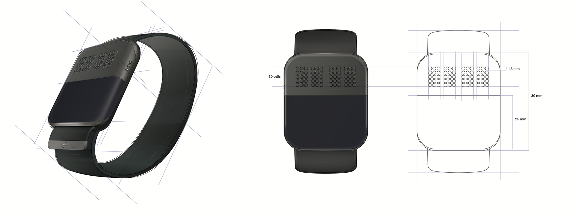
FINAL PRODUCT DESIGN & 3D prototype
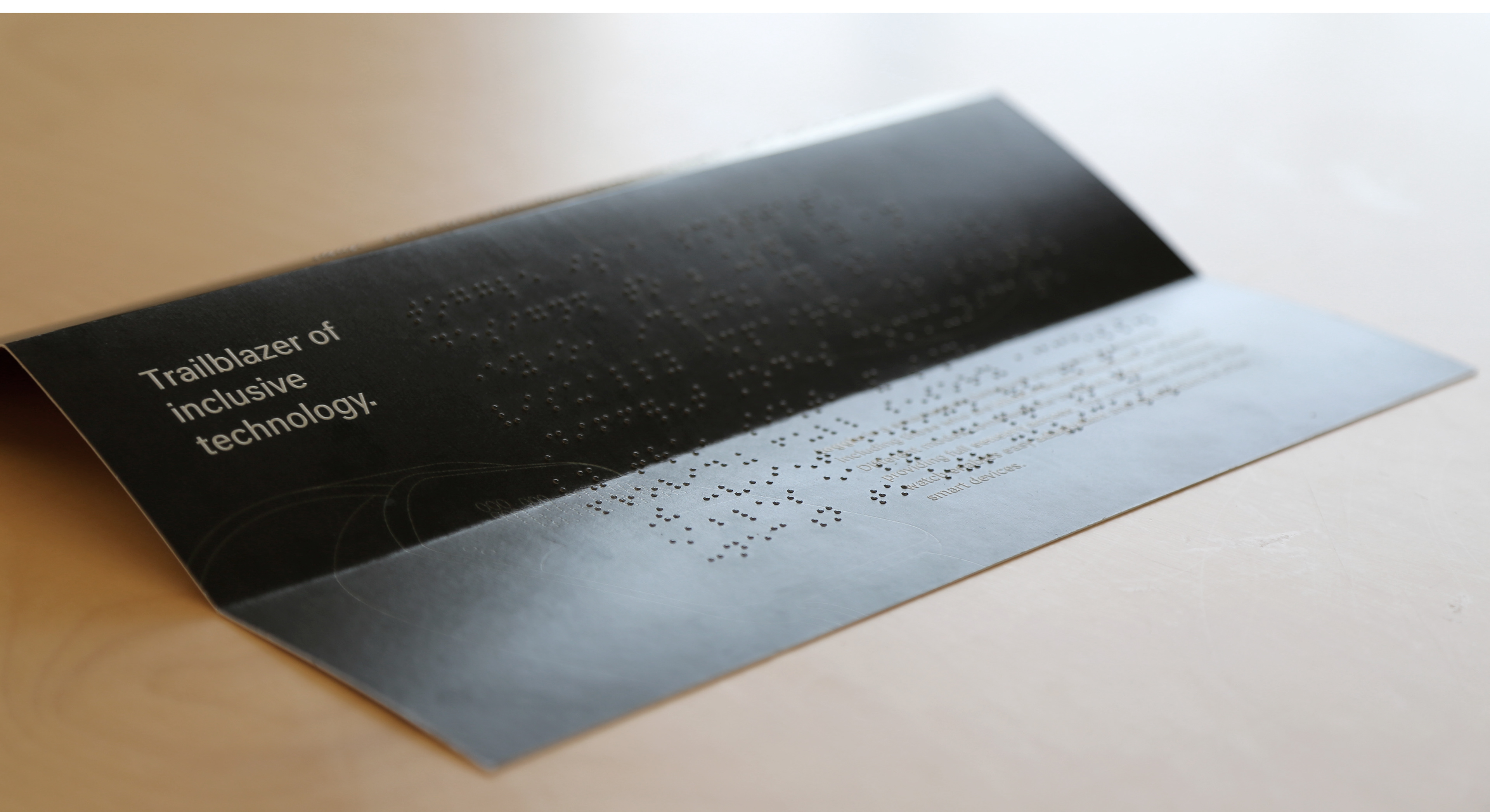
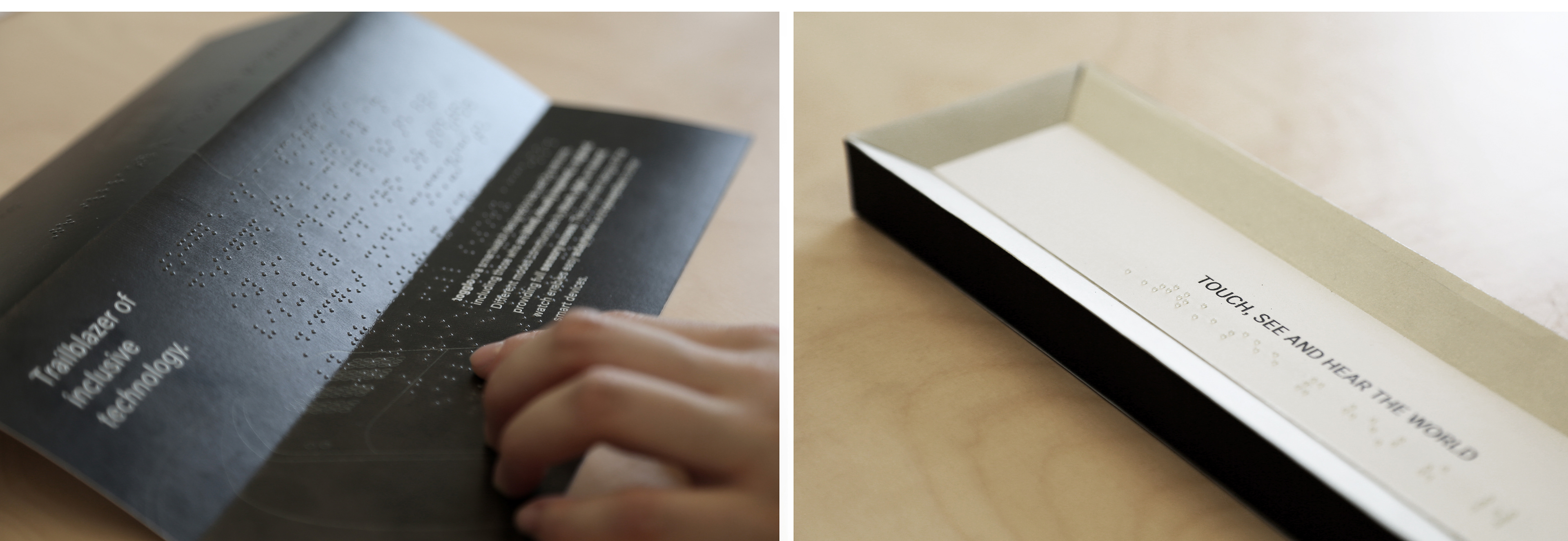
Branding and package design
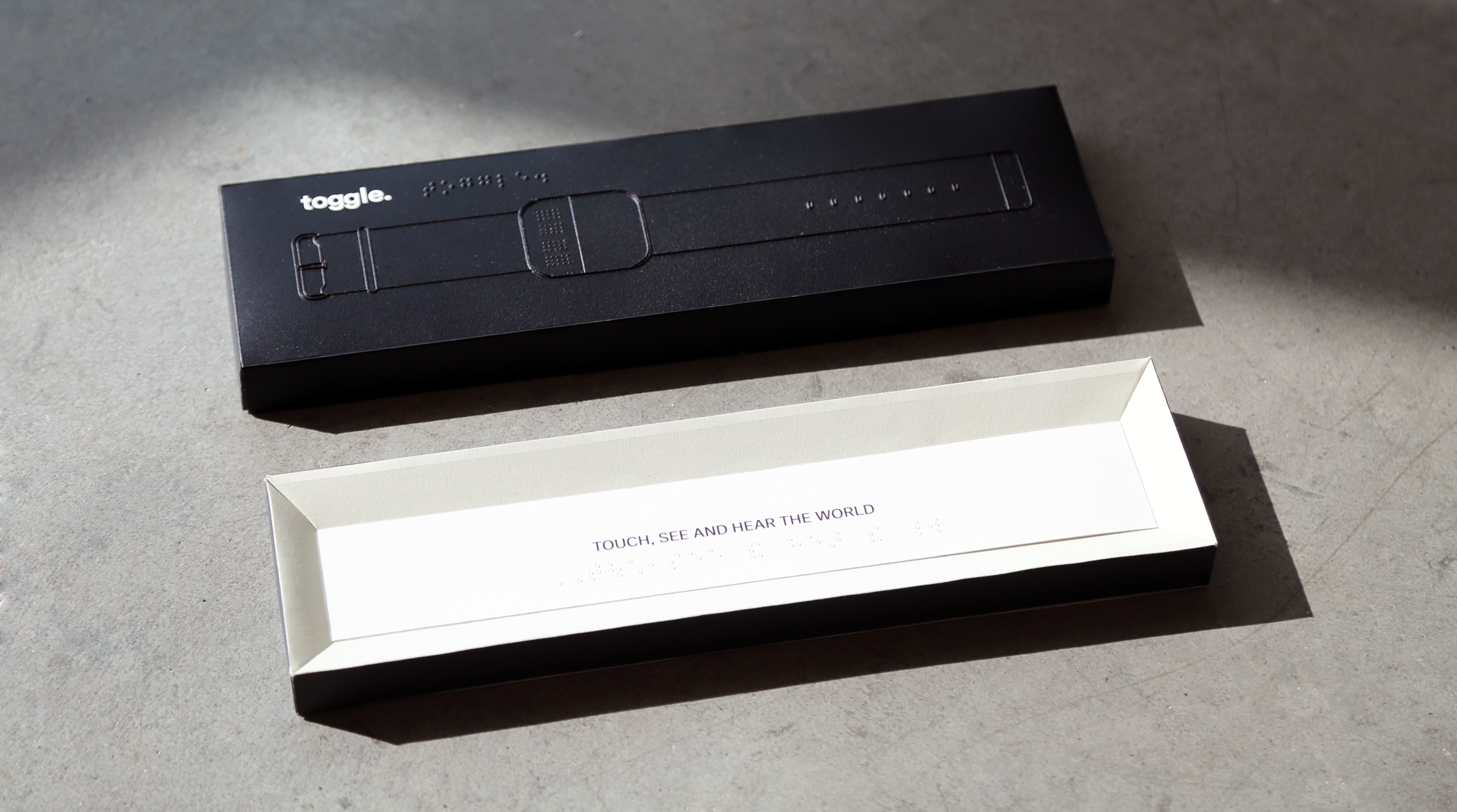
Embossing braille, illustration and typography in the design. After many iterations, I made a package design like this. I was also concerned about color, I wanted to keep the colors neutral and hence I decided not to use too many colors and maintained gradient of black and white. The reason for this is that neutral colors will appeal to a wide range of audience
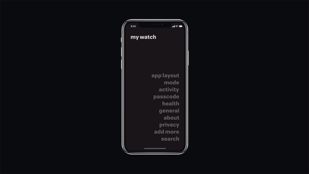
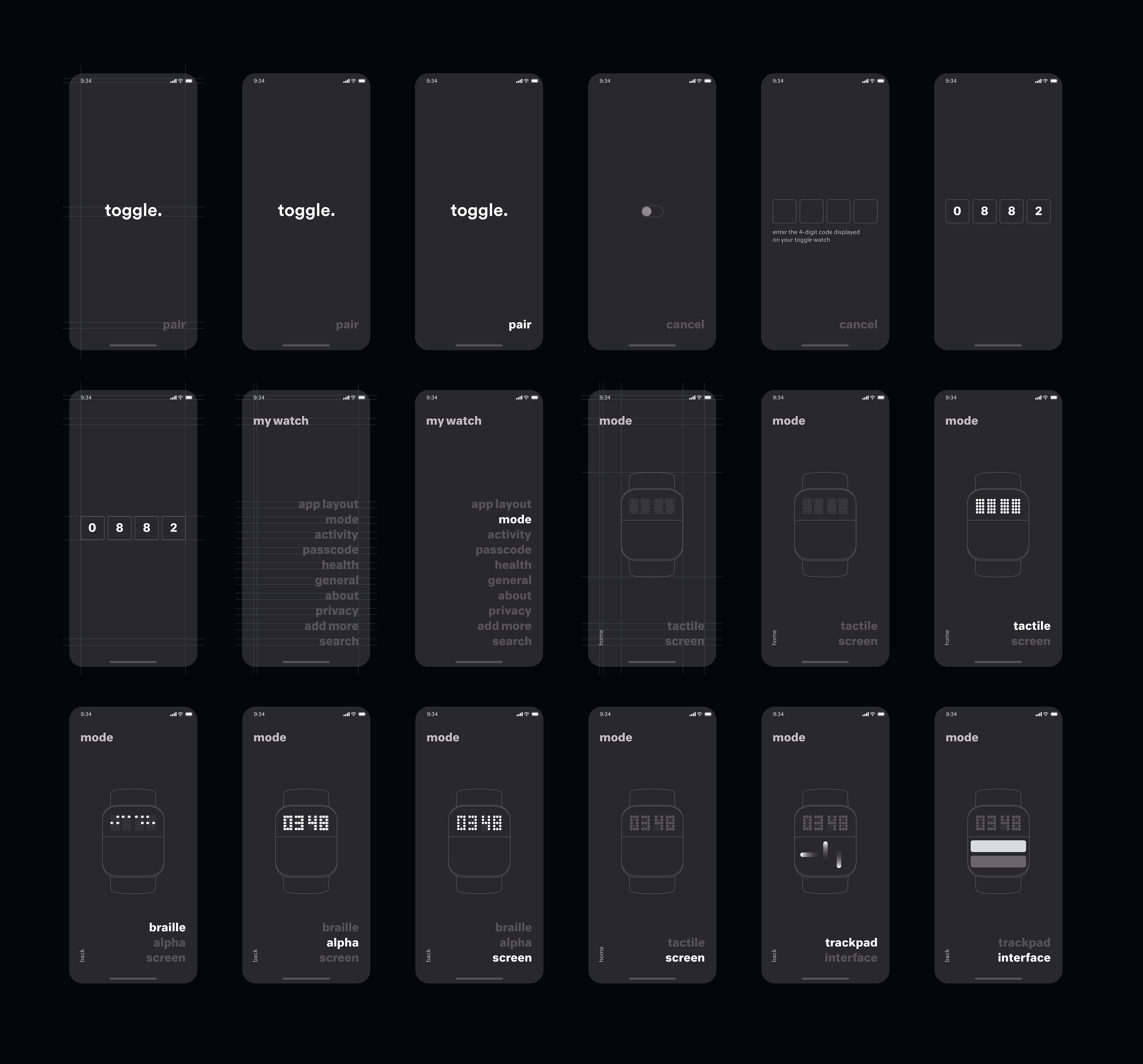
Toggle App — UI/UX design
PROMO VIDEO
Thanks for reading!