Having enjoyed the Light Phone but finding limited information from the current website, I decided to research and discovered an opportunity. Using my free time, I started redesigning the website as a personal project to improve my skills and make this great product more accessible to others.
My Role: UX Design, UI Design, Art Direction, Video Production, Branding
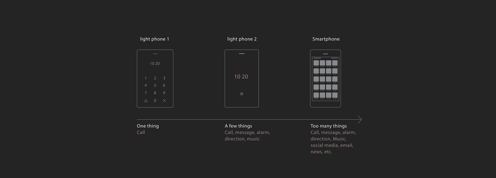
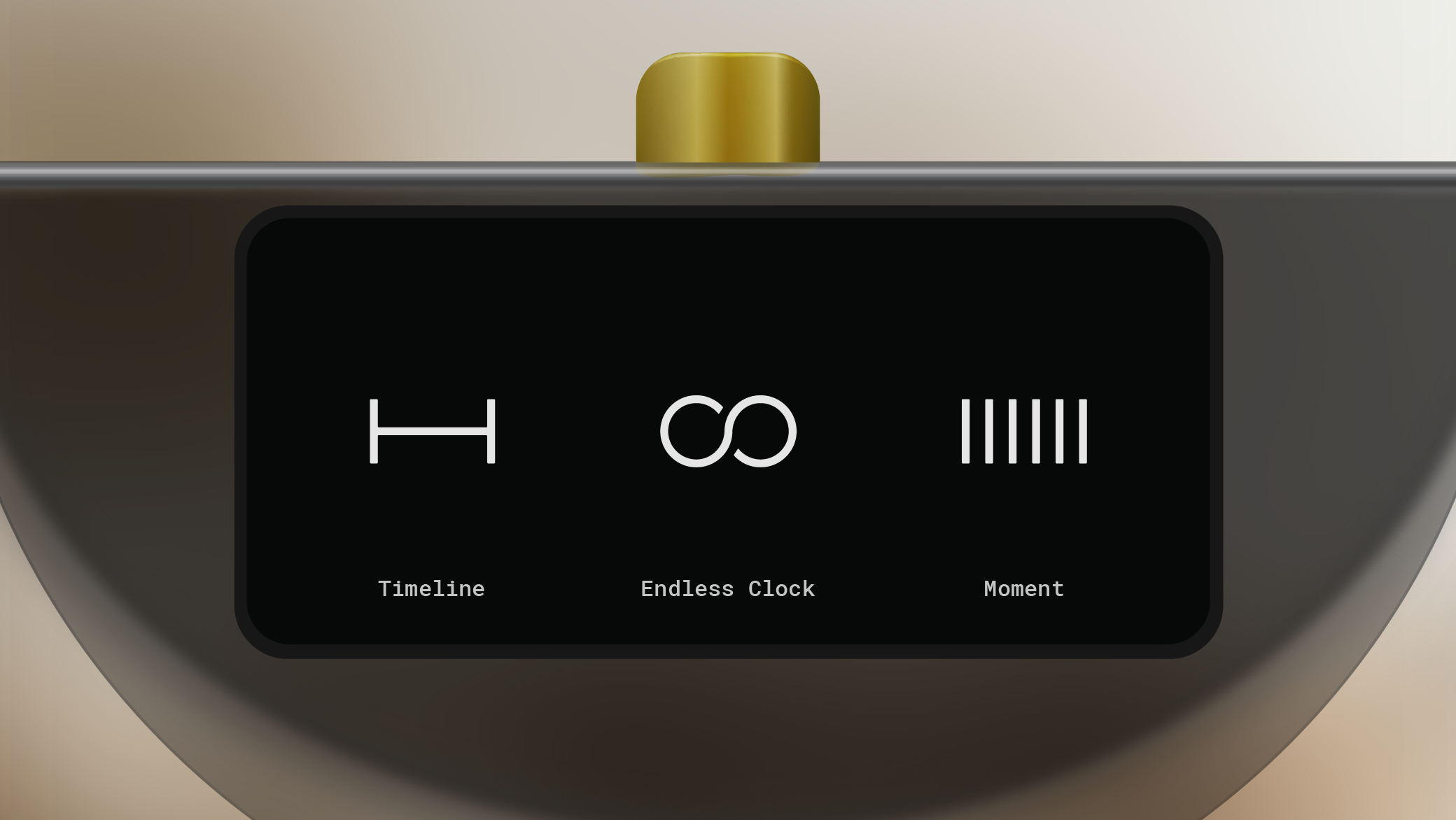
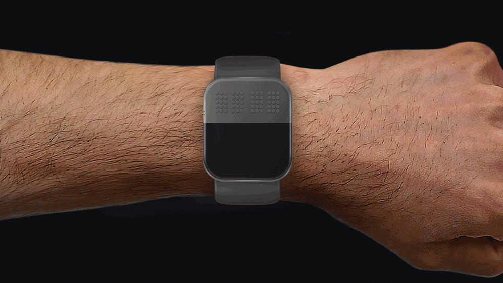
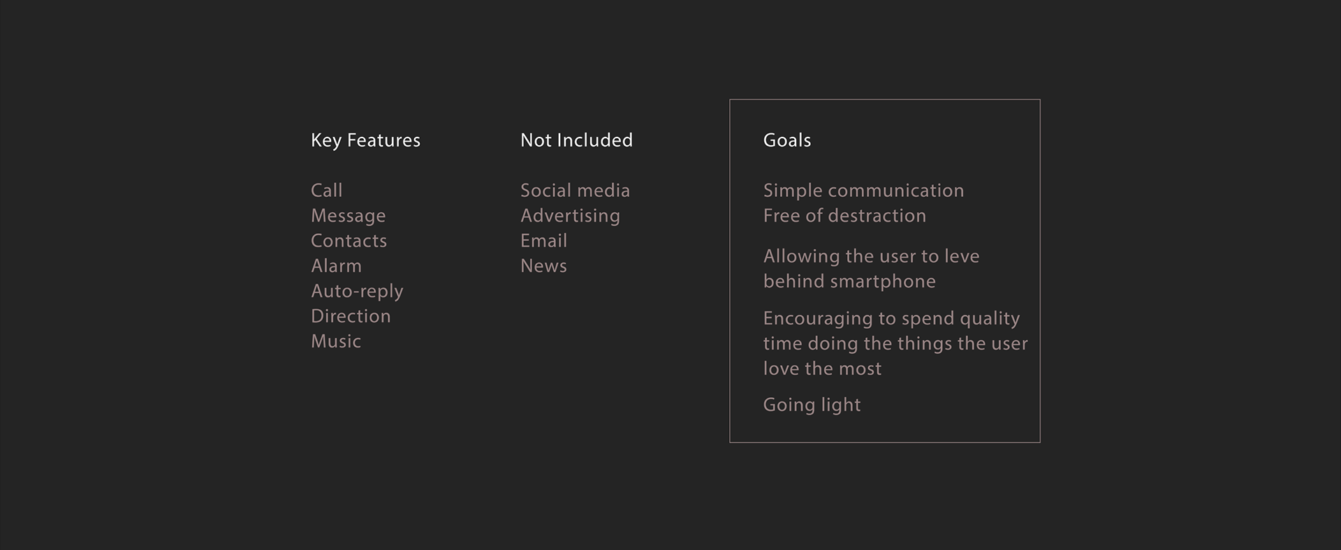
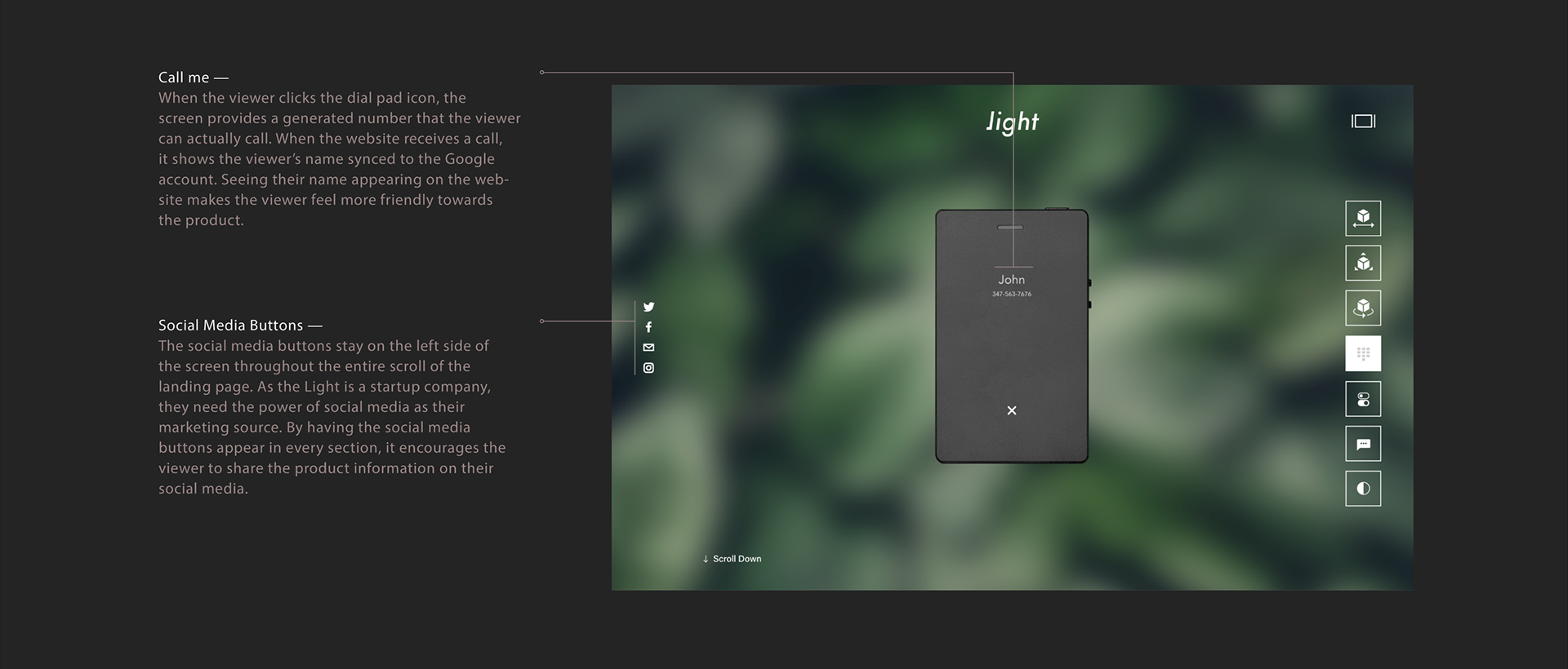
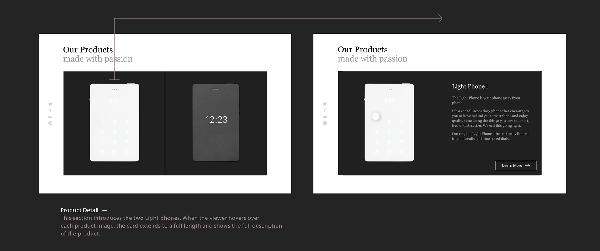
Light is a slim, credit card-sized phone designed to be used as little as possible. This minimal phone brings a few essential tools, like making calls, messaging and an alarm clock which provides the experience 'going light'. The concept behind the product is redefining actual quality of life by allowing the user to leave behind smartphone and encouraging them to spend quality time doing the things they love the most.
Light phone — Key Features & Goals
about CURRENT WEBSITE
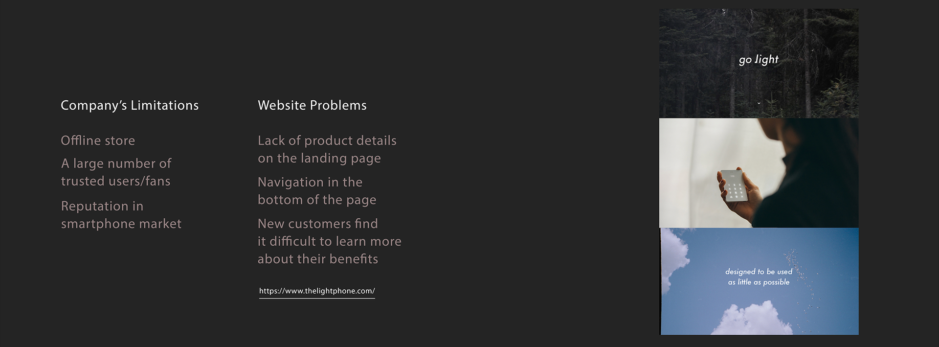
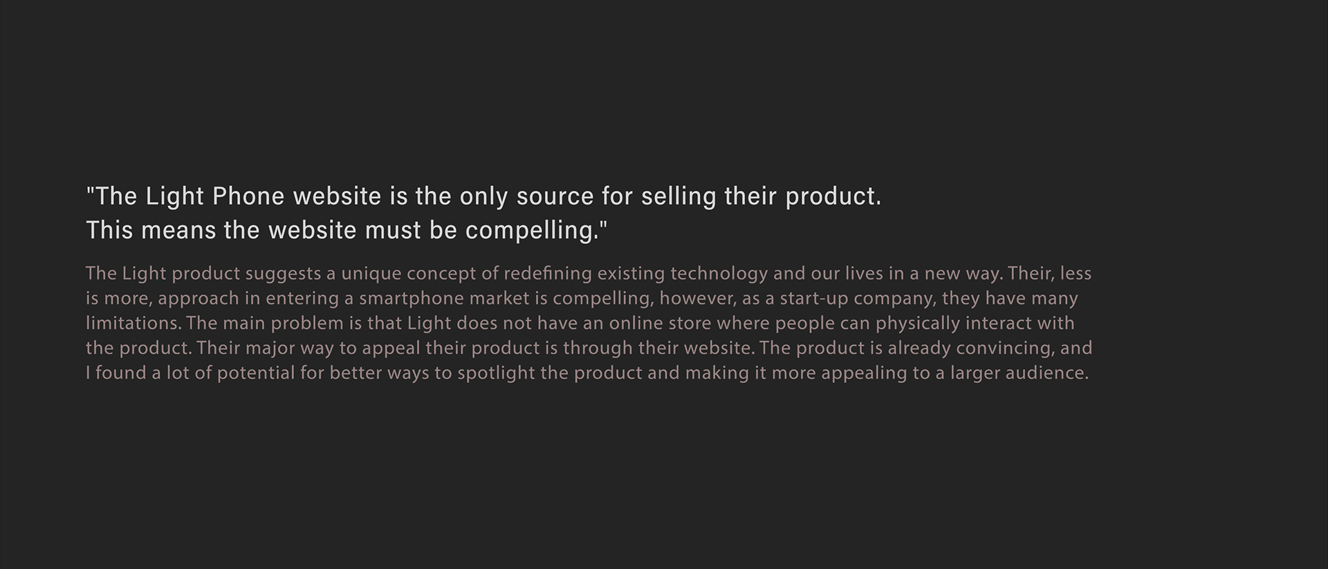
Currently, the only way to get the light phone is by placing an online order through their website. Without having an online store and a large audience that owns the Light phone, it is giving less opportunity for new customers to actually interact and get to know the product.
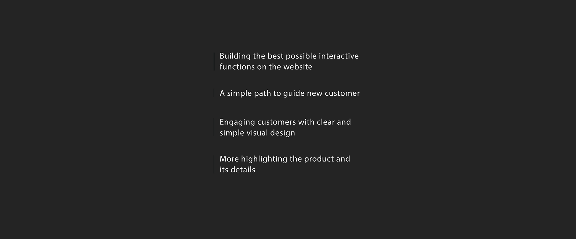
GOAL OF REDESIGNING THE WEBSITE
HOW TO IMPROVE ?
HERE IS THE REDESIGNED VERSION
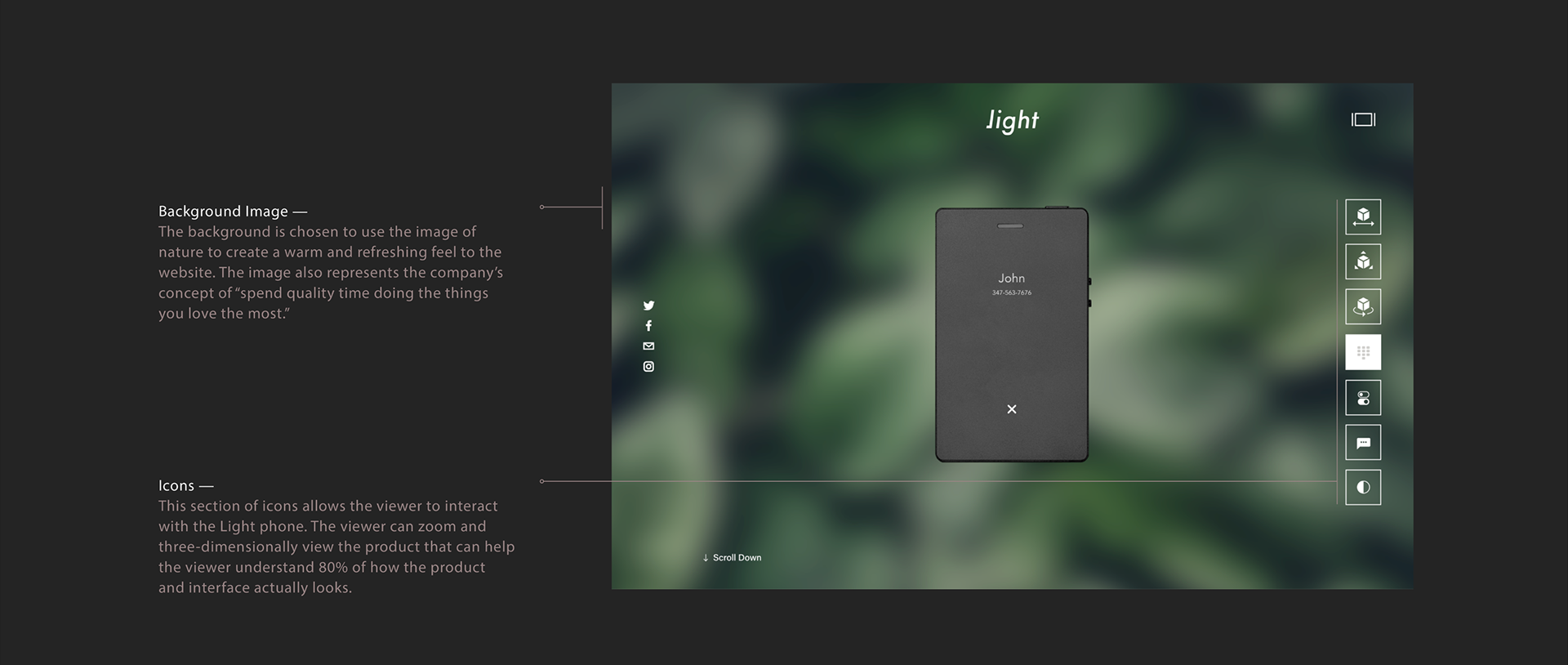
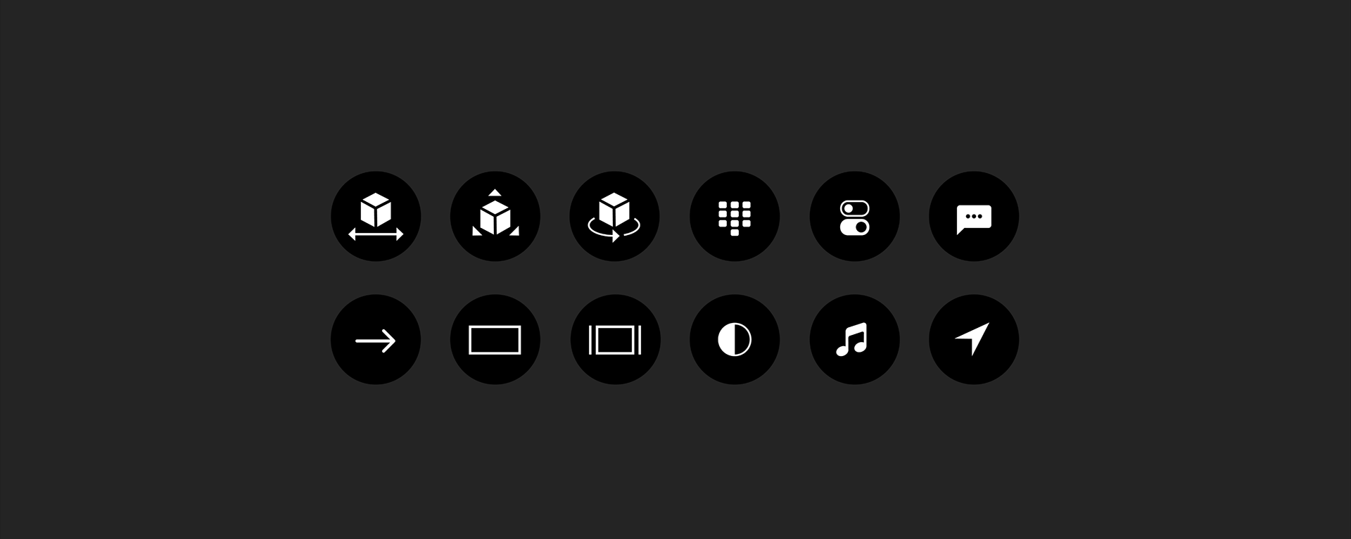
COLOR, TYPE & ICONS
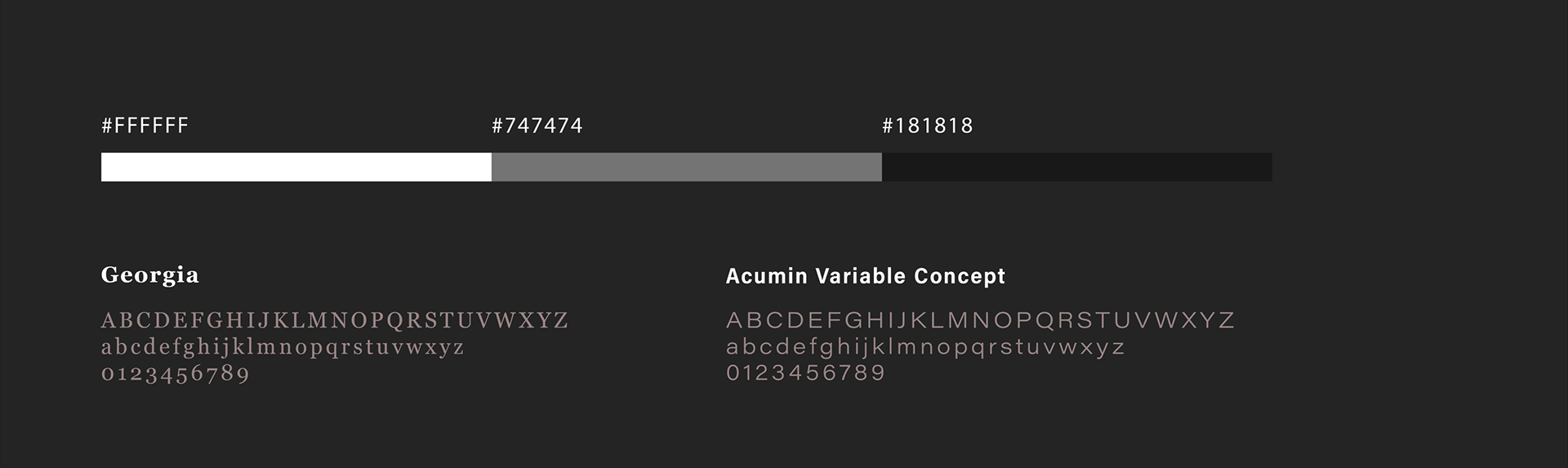
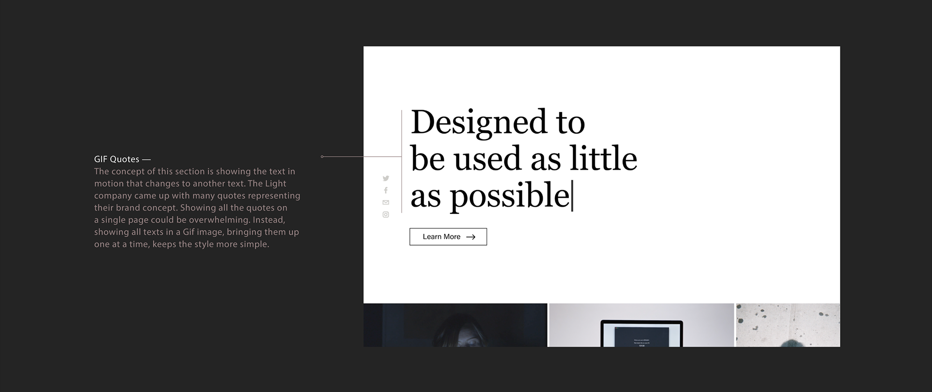
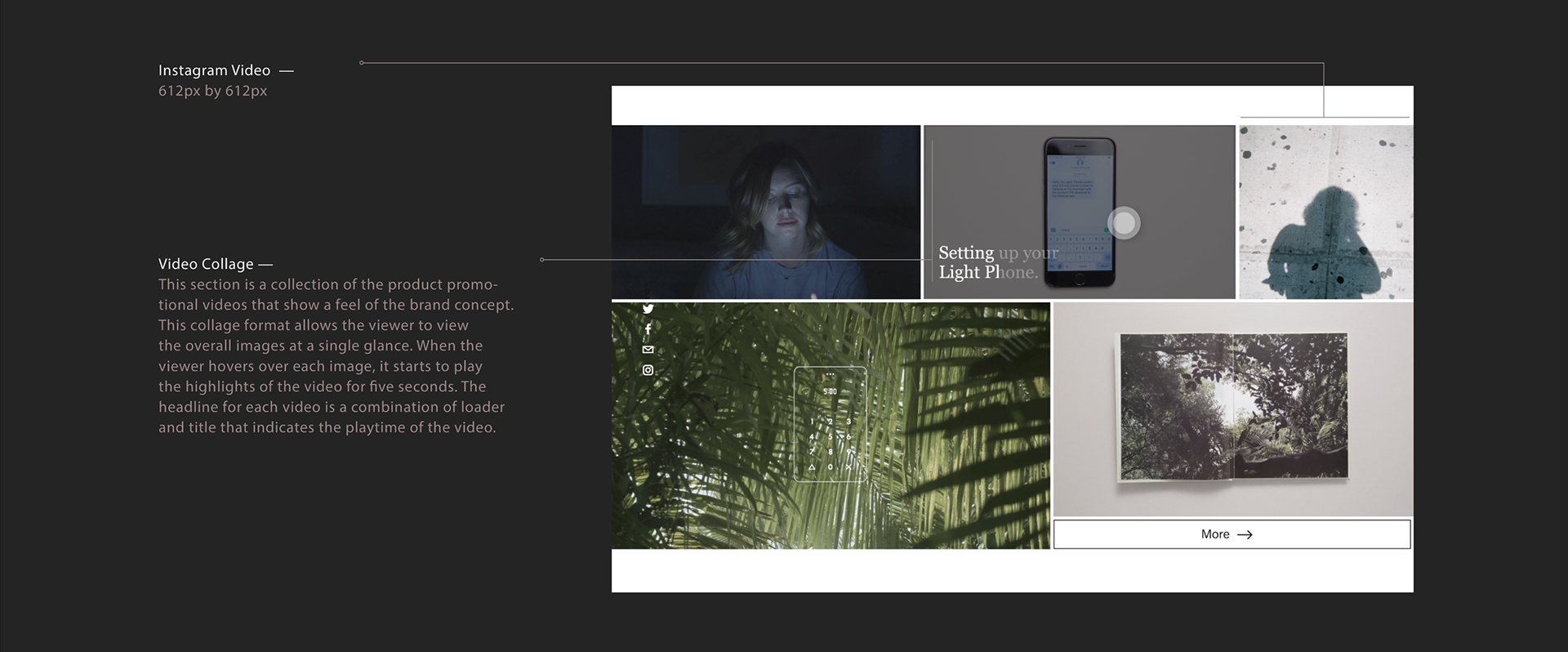
The serif typeface Georgia shows a number of traditional features and was chosen to match with the brand concept of 'going back to the basics! A secondary typeface Acumin is a sans serif typeface, and it was chosen to give a clean and simple feel that pairs well with Georgia. For the color palette, I used a greyscale to match the brand's minimal concept and to keep the consistency of black and white color for the product. The greyscale can also make the images in the website pop out.
NEW WEBSITE INTERACTION VIDEO
Thanks for reading!